Selecting & indexing
In most cases, the powerful data manipulation and indexing methods provided by xarray are sufficient; see the corresponding section of the xarray documentation.
In this guide, we will briefly cover some frequently used xarray features and introduce some additional methods provided by ERLabPy.
Basic xarray operations
import xarray as xr

xr.set_options(display_expand_data=False)
<xarray.core.options.set_options at 0x7f290342d6a0>
First, let us generate some example data: a simple tight binding simulation of graphene-like bands with an exaggerated lattice constant.
from erlab.io.exampledata import generate_data

dat = generate_data(seed=1).T
dat
<xarray.DataArray (eV: 300, ky: 250, kx: 250)> Size: 150MB
7.623 5.161 6.533 7.829 5.843 ... 8.52e-05 0.0007081 0.00283 0.0007781 0.0003691
Coordinates:
  * eV       (eV) float64 2kB -0.45 -0.4482 -0.4464 ... 0.08639 0.08819 0.09
  * ky       (ky) float64 2kB -0.89 -0.8829 -0.8757 ... 0.8757 0.8829 0.89
  * kx       (kx) float64 2kB -0.89 -0.8829 -0.8757 ... 0.8757 0.8829 0.89
We have a three-dimensional array of intensity given in terms of \(k_x\), \(k_y\), and binding energy.
For extracting 2D data (cuts and constant energy surfaces) or 1D data (MDCs and EDCs) given the coordinate values, xarray provides xarray.DataArray.sel().
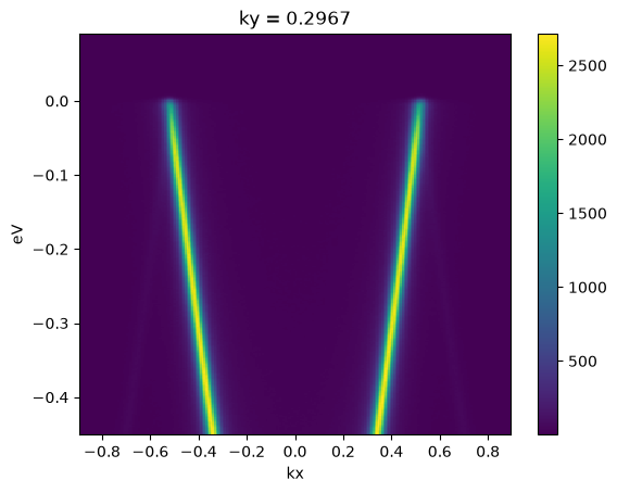
Let’s extract a cut along \(k_y = 0.3\).
dat.sel(ky=0.3, method="nearest").plot()
<matplotlib.collections.QuadMesh at 0x7f28e3729010>
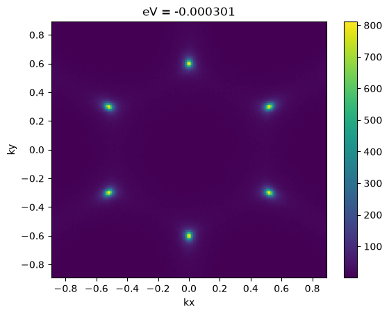
Likewise, the Fermi surface can be extracted like this:
dat.sel(eV=0.0, method="nearest").plot()
<matplotlib.collections.QuadMesh at 0x7f28e35d9310>
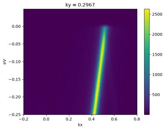
You can also pass slice objects to sel to
effectively crop the data.
cut = dat.sel(ky=0.3, method="nearest")
cut.sel(kx=slice(-0.2, 0.8), eV=slice(-0.25, 0.05)).plot()
<matplotlib.collections.QuadMesh at 0x7f28e1cce0d0>
In many scenarios, it is necessary to perform integration across multiple indices. This can be done by slicing and then averaging. The following code returns a new DataArray with the intensity integrated over a window of 50 meV centered at \(E_F\).
dat.sel(eV=slice(-0.025, 0.025)).mean("eV")
<xarray.DataArray (ky: 250, kx: 250)> Size: 500kB
2.163 1.982 2.091 2.336 2.162 1.841 ... 1.695 1.908 1.959 1.947 2.144 2.204
Coordinates:
  * ky       (ky) float64 2kB -0.89 -0.8829 -0.8757 ... 0.8757 0.8829 0.89
  * kx       (kx) float64 2kB -0.89 -0.8829 -0.8757 ... 0.8757 0.8829 0.89
However, doing this every time is cumbersome, and we have lost the coordinate eV. In
the following sections, we introduce some utilities for convenient indexing.
The qsel accessor
ERLabPy adds many useful extensions to xarray objects in the form of accessors.
Advanced selection
One is the xarray.DataArray.qsel() DataArray accessor, which streamlines the slicing and averaging process described above. It can be used like native DataArray methods:
dat.qsel(eV=0.0, eV_width=0.05)
<xarray.DataArray (ky: 250, kx: 250)> Size: 500kB
2.163 1.982 2.091 2.336 2.162 1.841 ... 1.695 1.908 1.959 1.947 2.144 2.204
Coordinates:
  * ky       (ky) float64 2kB -0.89 -0.8829 -0.8757 ... 0.8757 0.8829 0.89
  * kx       (kx) float64 2kB -0.89 -0.8829 -0.8757 ... 0.8757 0.8829 0.89
eV float64 8B 0.000602Note that the averaged coordinate eV is automatically added to the data array. This
is useful for further analysis.
With xarray.DataArray.qsel(), position along a dimension
can be specified in three ways:
As a value and width:
eV=-0.1, eV_width=0.05The data is averaged over a slice of width
0.05, centered at-0.1along the dimension'eV'.Hint
The value can also be provided as an array, e.g.,
eV=[-0.1, 0.0], eV_width=0.05.As a scalar value or an array:
eV=0.0oreV=[-0.2, -0.1, 0.0]If no width is specified, the data is selected along the nearest value for each element. It is equivalent to passing
method='nearest'toxarray.DataArray.sel().As a slice:
eV=slice(-0.2, 0.05)The data is selected over the specified slice. No averaging is performed.
The arguments can either be provided in a key-value form, or as a single dictionary.
Unlike xarray.DataArray.sel(), all of this can be combined in a single call:
dat.qsel(kx=slice(-0.3, 0.3), ky=0.3, eV=0.0, eV_width=0.05)
<xarray.DataArray (kx: 84)> Size: 672B
6.391 5.72 5.593 5.375 5.252 5.058 4.878 ... 4.851 5.109 5.642 5.652 5.914 6.019
Coordinates:
  * kx       (kx) float64 672B -0.2967 -0.2895 -0.2824 ... 0.2824 0.2895 0.2967
    ky       float64 8B 0.2967
eV float64 8B 0.000602Note
You can copy the arguments for xarray.DataArray.qsel() that reproduces the slice shown in ImageTool from the right-click menu of each plot.
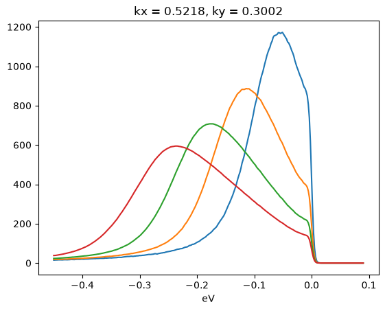
Averaging data within a distance
To average data over all data points within a certain distance of a given point, the method xarray.DataArray.qsel.around() can be used.
The following code plots the integrated EDCs near the K point (\(k_x\sim\) 0.52 Å \(^{-1}\), \(k_y\sim\) 0.3 Å \(^{-1}\)) for different radii.
for radius in (0.03, 0.06, 0.09, 0.12):
    dat.qsel.around(radius, kx=0.52, ky=0.3).plot()
Averaging across dimensions
Taking a mean across multiple dimensions is a common operation, and can be performed easily with xarray.DataArray.mean(). However, it is often necessary to preserve the coordinate information of the averaged dimension. In this case, xarray.DataArray.qsel.mean() can be used.
The following code first selects the data around the Fermi level, and calculates the average of the intensity over the energy axis. The coordinate eV is preserved in the resulting DataArray.
dat.sel(eV=slice(-0.05, 0.05)).qsel.mean("eV")
<xarray.DataArray (ky: 250, kx: 250)> Size: 500kB
2.041 2.0 1.997 2.006 2.037 1.818 1.637 ... 1.726 1.998 2.1 2.121 2.332 2.342
Coordinates:
  * ky       (ky) float64 2kB -0.89 -0.8829 -0.8757 ... 0.8757 0.8829 0.89
  * kx       (kx) float64 2kB -0.89 -0.8829 -0.8757 ... 0.8757 0.8829 0.89
eV float64 8B -0.000301Masking
ERLabPy provides a way to mask data with arbitrary polygons.
Work in Progress
This part of the user guide is still under construction. For now, see the API reference at erlab.analysis.mask. For the full list of packages and modules provided by ERLabPy, see API Reference
Interpolation
In addition to the powerful interpolation methods
provided by
xarray, ERLabPy provides a convenient way to interpolate data along an arbitrary
path.
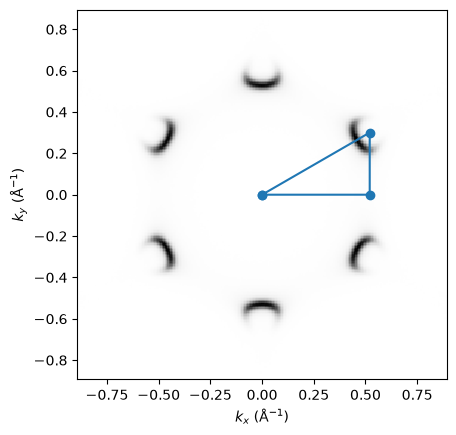
Consider a Γ-M-K-Γ high symmetry path given as a list of kx and ky coordinates:
import erlab.plotting as eplt
import matplotlib.pyplot as plt
import numpy as np

a = 6.97
kx = [0, 2 * np.pi / (a * np.sqrt(3)), 2 * np.pi / (a * np.sqrt(3)), 0]
ky = [0, 0, 2 * np.pi / (a * 3), 0]


dat.qsel(eV=-0.2).qplot(aspect="equal", cmap="Greys")
plt.plot(kx, ky, "o-")
[<matplotlib.lines.Line2D at 0x7f28e04be850>]
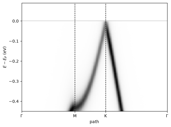
The following code interpolates the data along this path with a step of 0.01 Å \(^{-1}\) using slice_along_path.
import erlab.analysis as era

dat_sliced = era.interpolate.slice_along_path(
    dat, vertices={"kx": kx, "ky": ky}, step_size=0.01
)
dat_sliced
<xarray.DataArray (eV: 300, path: 140)> Size: 336kB
4.724 3.861 5.808 6.319 5.855 5.453 ... 0.3454 0.1366 0.005475 0.006478 0.09401
Coordinates:
  * eV       (eV) float64 2kB -0.45 -0.4482 -0.4464 ... 0.08639 0.08819 0.09
  * path     (path) float64 1kB 0.0 0.01021 0.02041 ... 1.402 1.412 1.422
    kx       (path) float64 1kB 0.0 0.01021 0.02041 ... 0.01764 0.008821 0.0
ky (path) float64 1kB 0.0 0.0 0.0 0.0 ... 0.01528 0.01019 0.005093 0.0We can see that the data has been interpolated along the path. The new coordinate path contains the distance along the path, and the dimensions kx and ky are now expressed in terms of path.
The distance along the path can be calculated as the sum of the distances between consecutive points in the path.
dat_sliced.qplot(cmap="Greys")
eplt.fermiline()

# Distance between each pair of consecutive points
distances = np.linalg.norm(np.diff(np.vstack([kx, ky]), axis=-1), axis=0)
seg_coords = np.concatenate(([0], np.cumsum(distances)))

plt.xticks(seg_coords, labels=["Γ", "M", "K", "Γ"])
plt.xlim(0, seg_coords[-1])
for seg in seg_coords[1:-1]:
    plt.axvline(seg, ls="--", c="k", lw=1)
Note
The xarray.DataArray.qplot() method used to plot the data is an accessor that enables convenient plotting. You will learn more about it in the next section.
GUI equivalent
Use ImageTool to discover slice limits, bin widths, and polygon ROIs visually. See Operation map for detailed explanations of how to perform these operations.